Every year Summit Brewery commisions local talent to design a poster celebrating the anniversary of the repeal of prohibition. This poster was designed my Studio MPLS, it was the 2012 poster but I like it nevertheless.
Hi, welcome to my blog! I'm Carina Bee; an aspiring surface pattern and graphic designer. This is a selection of my favourite prints, graphics, products and fonts as well as tips and useful information.I will use my blog as inspiration through my journey to becoming a graphic designer. I hope it inspires you too.
Friday, 12 July 2013
Packaging & Brand Identity - Handsome Coffee Roasters by Ptarmark Inc
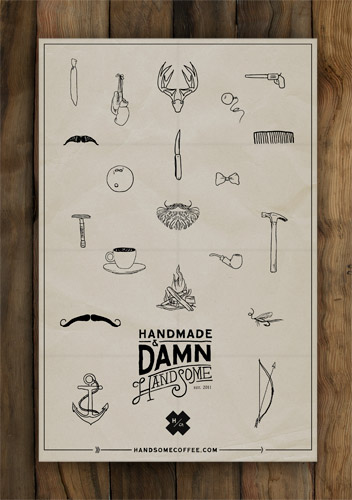
Love the fonts, love the colours, the illustrations and the general quirkiness. The packaging, designed by Ptarmark, almost makes the product seem like "gentleman's" coffee.
Handsome Coffee Roasters are based in the US only at the moment - check out their website for more fun illustrations and to find out more about them.
Labels:
Brand Identity,
Branding,
Food packaging,
Packaging,
Typography
Packaging - Noble Handcrafted by Heather Nguyen
"Noble handcrafted is a brand that embraces the collaboration of craft with new American food traditions that are being continually redefined"
The old style lavelling with the "wax" bottle cap really emphasise the hand crafted feel. This looks like something you might find in your grandma's cupboard from 50 years ago.
Designed by Heather Nguyen.
Wednesday, 10 July 2013
Business Stationary - Kevin Cantrell Design
How cool is this business stationary designed by Kevin Cantrell for the Law Office of Matthew Messina!? I love the fonts used and the illustrations- gives the feeling of professional but personal law firm.
Monday, 8 July 2013
Packaging & Branding - Sangria Lolea by Estudio Versus
Some more amazing Spanish packaging for you...I don't know a single female who wouldn't love this Sangria packaging.
Lolea brought in Estudio Versus to create this amazing packaging and brand identity for them and I absolutely love it! Lolea; an artisan ready made Sangria is actually a personal project of a group of friends who wanted to share what they love and in their own words; is a tribute to friendship, family, holidays and joy. Ahhh...Salud!
Typography Update - 365 Days of Type by Sabrina Smelko
I thought it was about time I did an update on Sabrina's wonderful 365 days of type, again I have picked out some of my favourites but I actually do love them all...click here if you want to see the whole lot!
Packaging & Brand Identity - The Cuckie Fam
I have been away from Blogger for a while...after a trip to Hong Kong, a 3 week visit to my homeland (England) and the organisation of a Mexican Birthday Fiesta I am now ready to get back to it!
I came across these amazing biscuits, biscuits are one of my favourite things in life so this post was perfect for me! The packaging and branding was created by Spanish creative studio Oloramara, these guys are behind some really cute and cool concepts so you should definitely take a look at their website!
Mmmmm....now to go find some biscuits.
Subscribe to:
Posts (Atom)